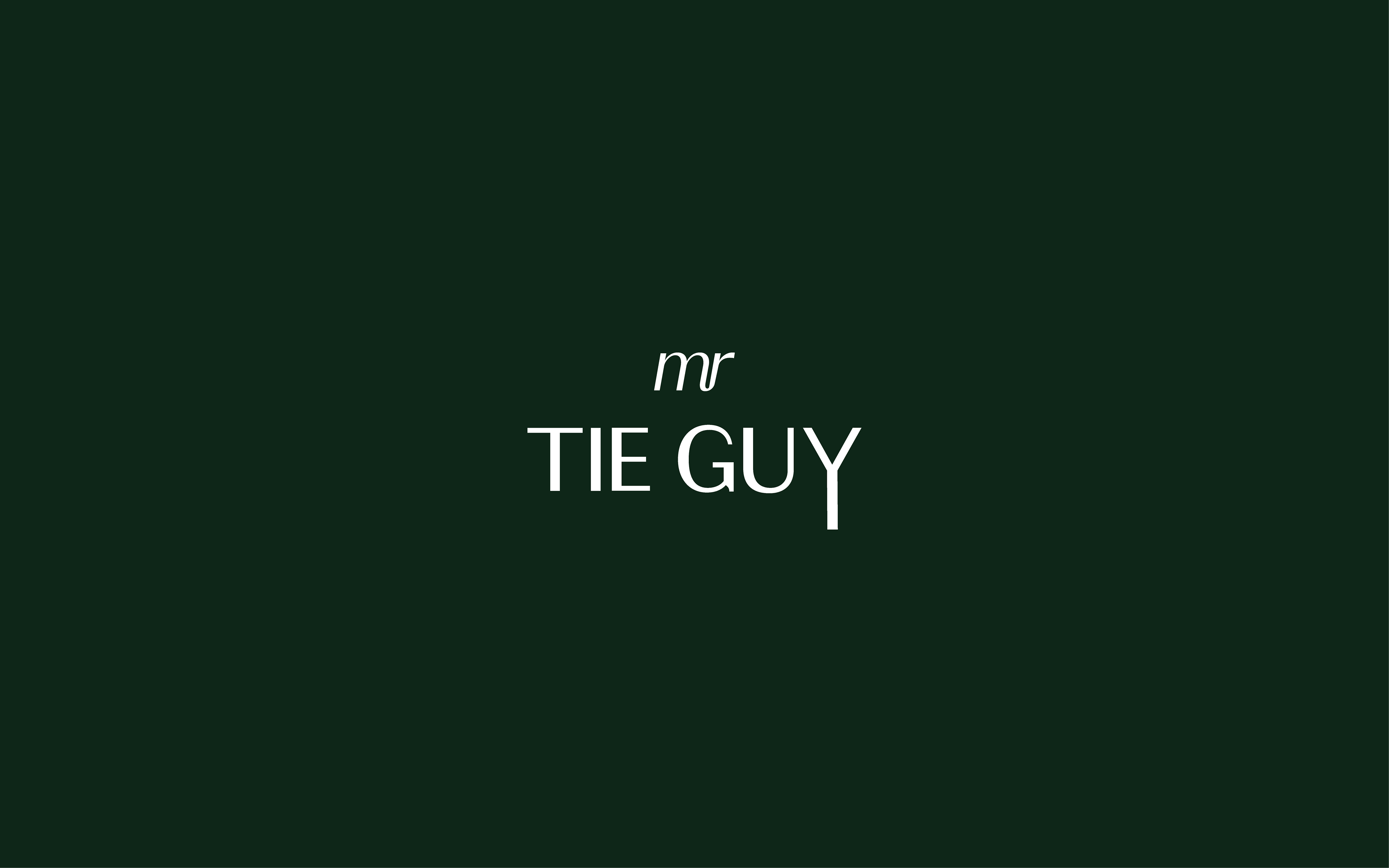
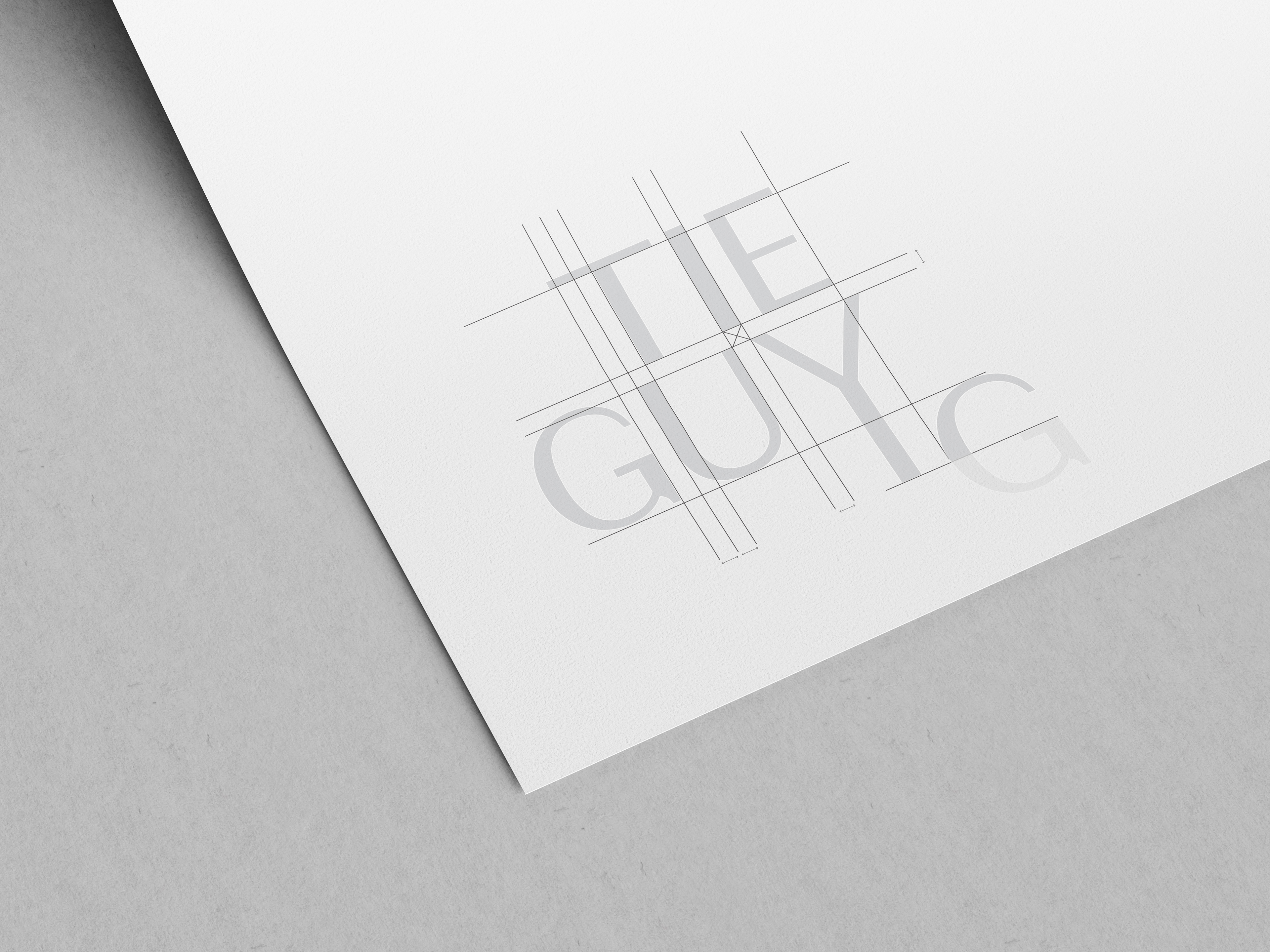
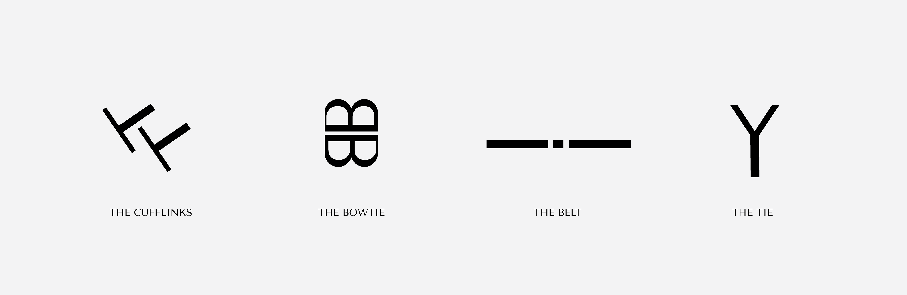
The logo re-design for Mr Tie Guy relies on the typographic treatment to subtly form a tie with the extension of the letter Y. This is carried across throughout the development of icons which mimic the form of products such as cufflinks, belts and bow ties by experimenting with the positioning and manipulation of letters.